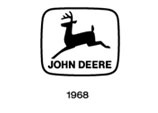
1968—A Clean-cut, Contemporary Look
Advertisements
 A more clean-cut, contemporary look marked the revision in 1968. A company memo noted, "the new trademark is in keeping with the progress being made throughout all divisions of the Company... it provides for better reproduction and greater readability under a wider range of usage." The design was modernized and streamlined to show a straight-side silhouette with just two legs, instead of the four, and one four-point rack of antlers. The "John Deere" logotype was changed using a hand-modified version based on the Helvetica font. The width of the ellipse border was narrowed and the size ratio of the deer inside it increased.
Copyright© 2003 Deere & Company Archives
